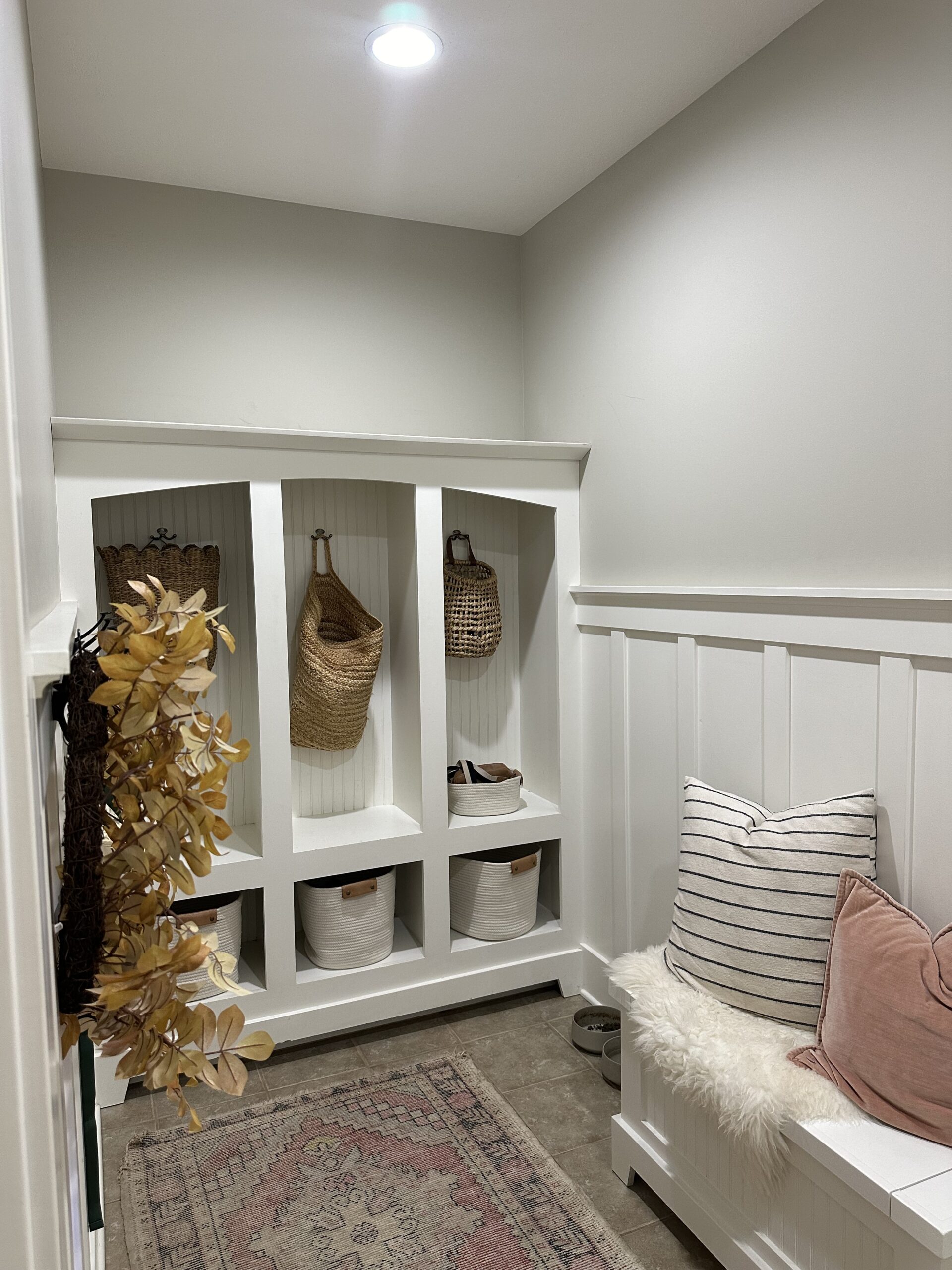
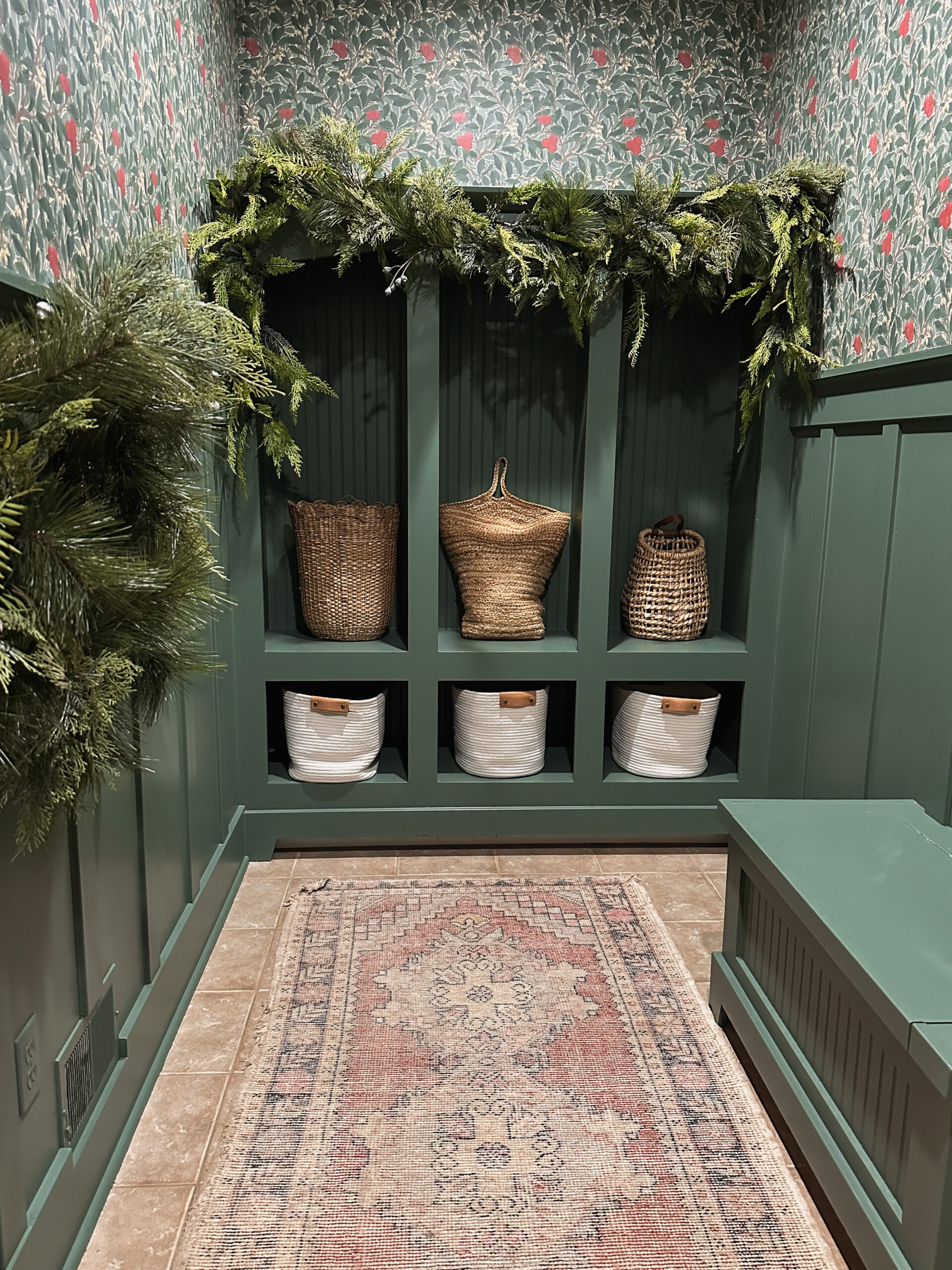
Adding Character to our Mudroom
Since moving into our new home I have been slowly gaining vision for different areas. I really didn’t want to rush into anything too soon but instead wanted to see how we lived here first. I have been very intentional with more “permeant” decisions such as wallpaper, as I know we will be here for quite some time. Paint is easy to change, removing wallpaper takes more effort.
After a few weeks I had vision for our Mudroom. I always ask myself a few questions before I dive into a room transformation.
- Does it function well for our family in our current season?
- What is NOT working in this space?
- How can I make this room better for the season we are in *or the budget we have set aside?
- What type of Atmosphere do I want to create?
After I have gone through and asked myself those few questions only then can I begin to dream up how I want it to look.
This space actually functions well. We have a large closet, build in storage and hooks for coats and backpacks. However, it didn’t feel like *my* home. This was the first space you walk into from the garage and every time I walked in, I just felt like I was stepping into someone else’s home.

I have read a lot of design books that suggest you should start where your “guests” come in first to set the tone for them. But, I live here and I want to feel welcomed in my own home too. So, we started in the space that guests actually don’t come in. Except the neighbor boys who have commented how nice it looks, so sweet!
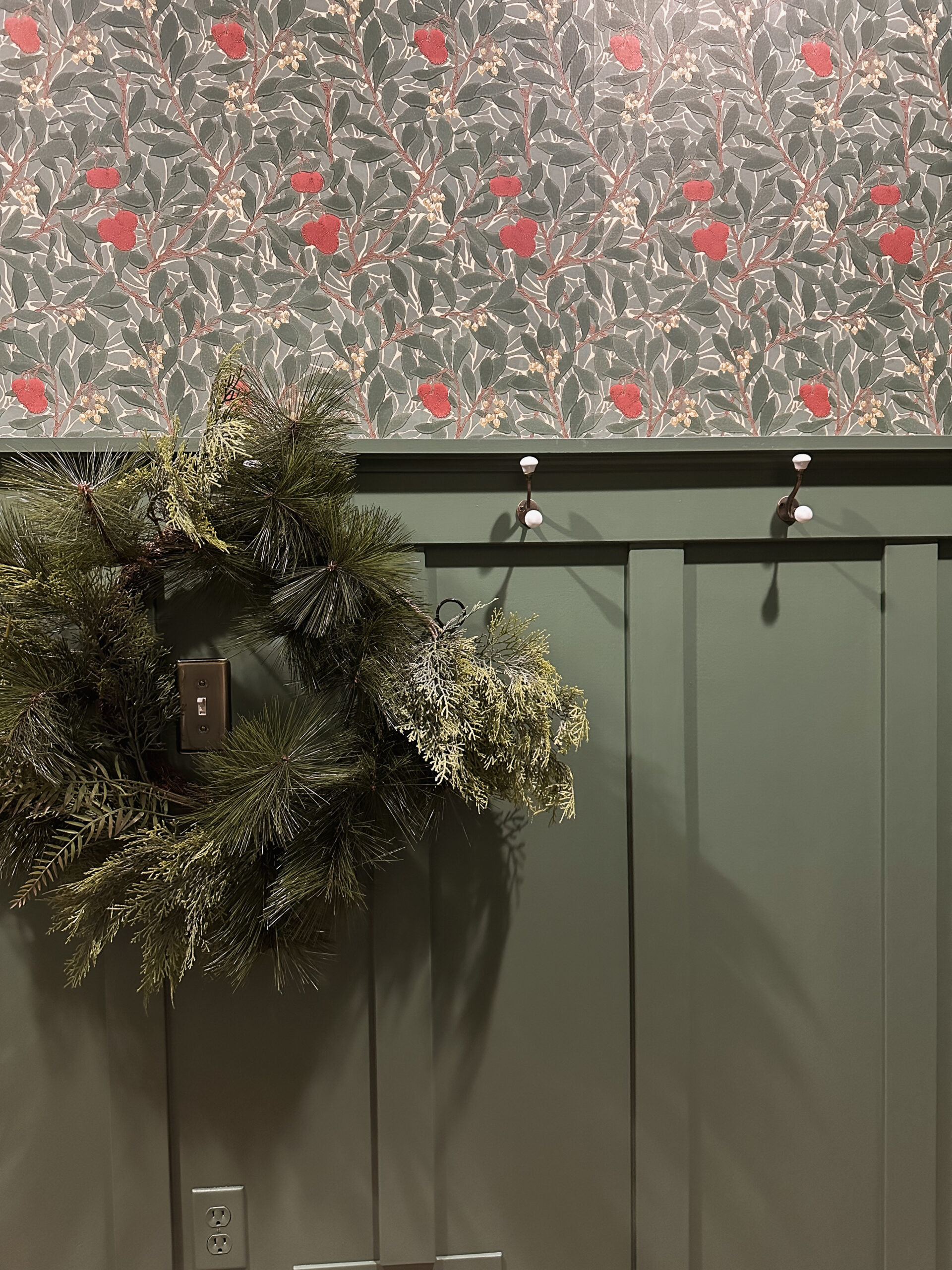
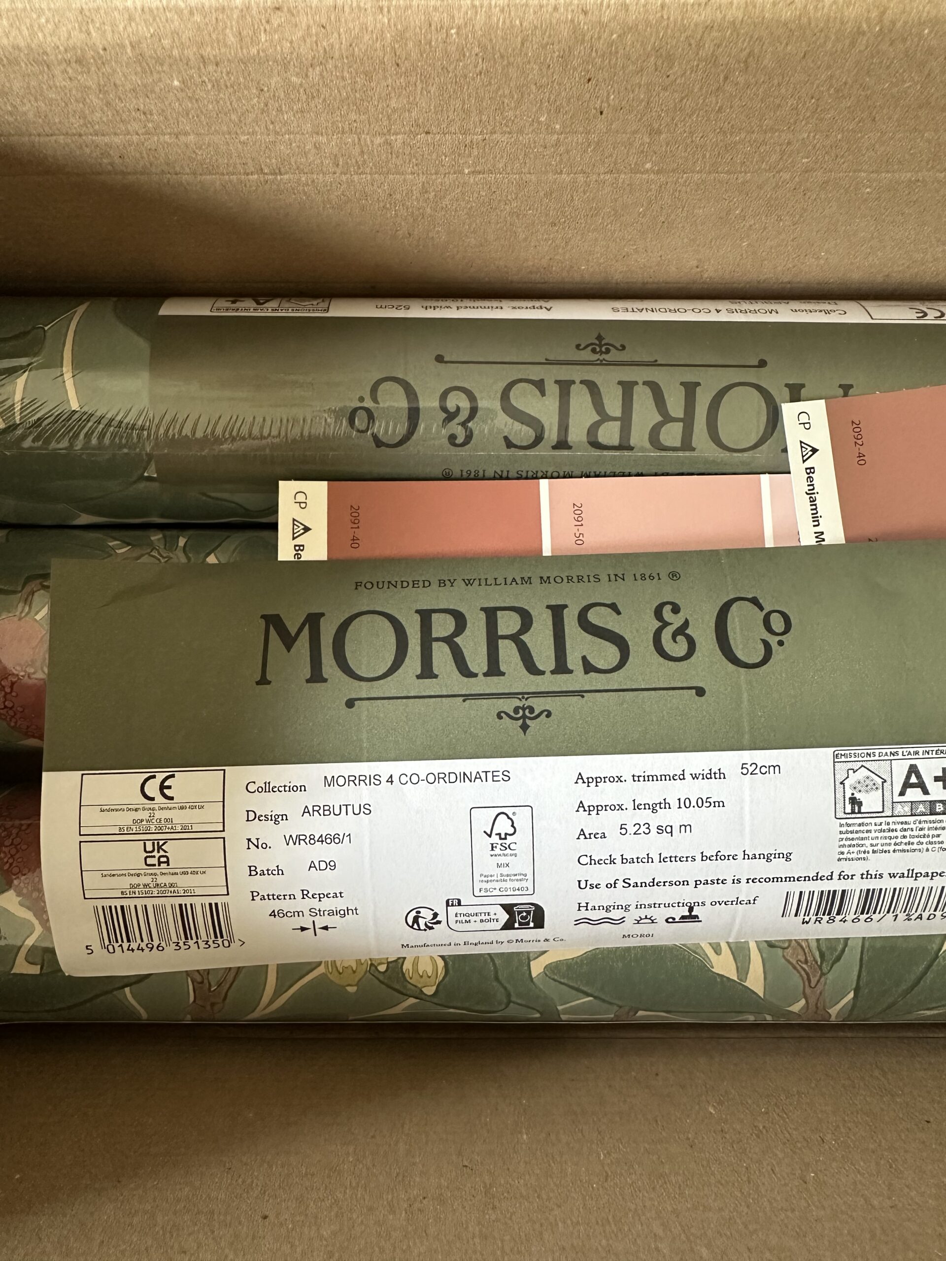
I had my heart set on wallpaper. I am a huge fan. It is so transformative and can add so much impact. This mudroom has tall ceilings so I went with a bolder choice. This Morris and Co. paper in the print Arbutus is so captivating. It drew me in immediately and I knew it would really transform this Mudroom.
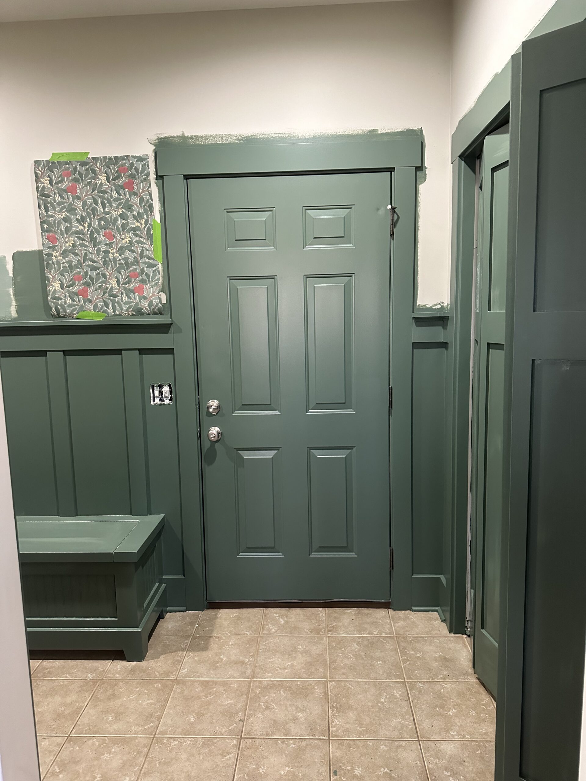
The room already had beautiful moldings and build ins so I decided to color match my wallpaper at my local RepcoLite. They were able to pull 3 different color choices from the wallpaper. I did try a really really bold redish color but ultimately I went with a deep tealish green. I am so happy with that decision.
For the paint we used Scuff X which is a very durable pair perfect for high traffic areas, it’s washable and I can have peace of mind knowing that it will stand up to my boys. I found out that a lot of Hospitals and Schools use it in a higher sheen because of its toughness and scuff resistance.

Painting the built ins and moldings a deep green actually made all the small details stand out more. I walk in and smile every time. It is never lost on me how paint and a few tweaks can really transform a room.

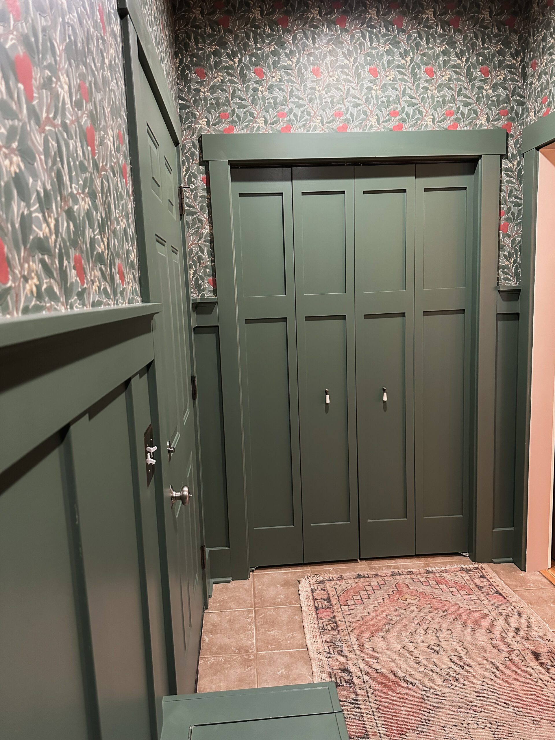
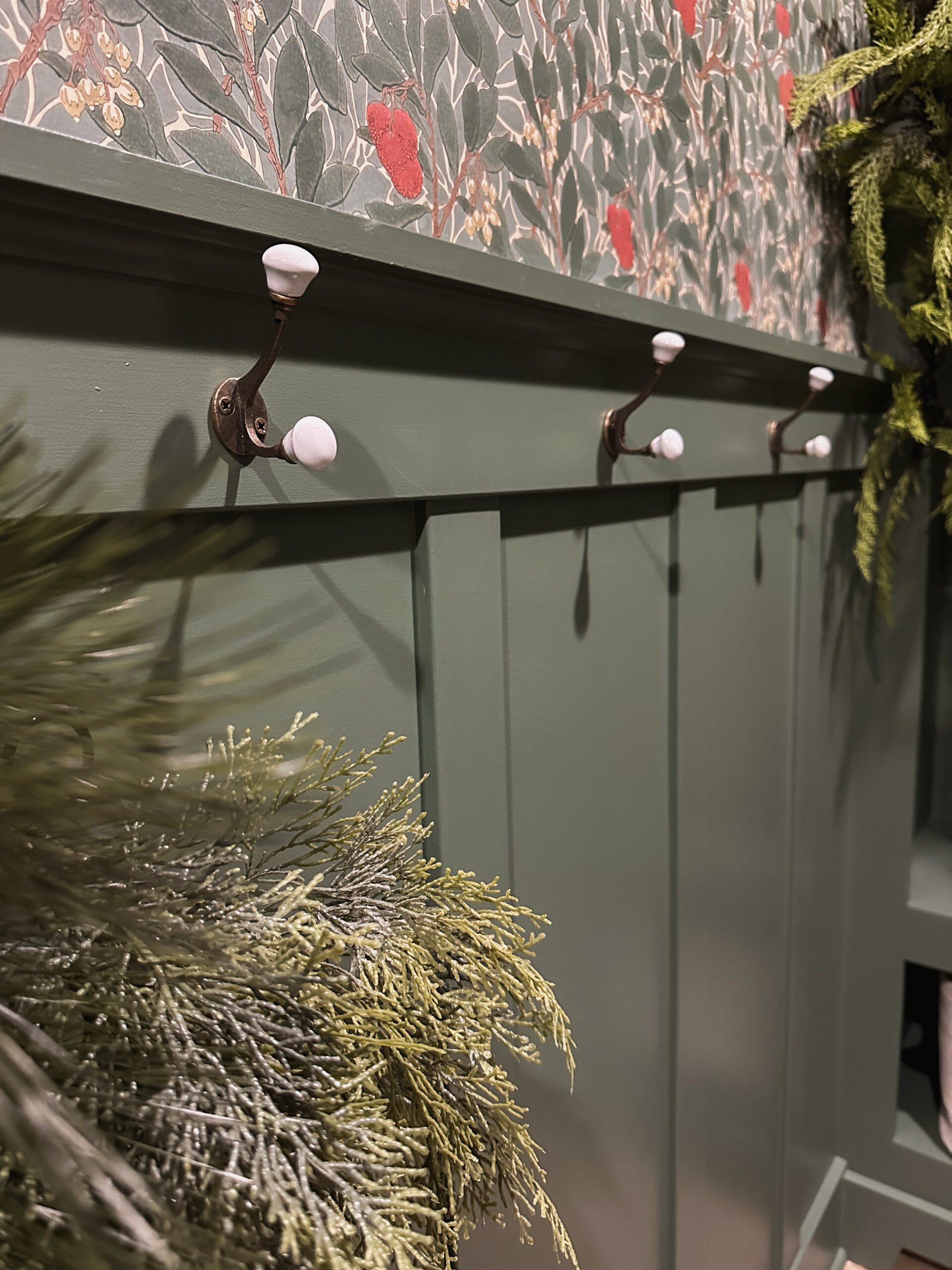
We swapped out the hooks and pulls for these porcelain tipped ones from Zara. It’s simple but it’s the perfect pop of white again the deep green. The closet door pulls look more like dangly jewelry to me but it works great. These would be the perfect addition to a dress too.
What do you think of the transformation?
